BRANDS / TIRE STYLE GUIDE
How to Get the Goodyear Eagle Sidewall Look
How to recreate the bold, all-American Goodyear Eagle look on your own sidewalls. Independent product; not affiliated with or endorsed by Goodyear or any tire manufacturer.
How to recreate the bold, all-American Goodyear Eagle look on your own sidewalls. Independent product; not affiliated with or endorsed by Goodyear or any tire manufacturer.
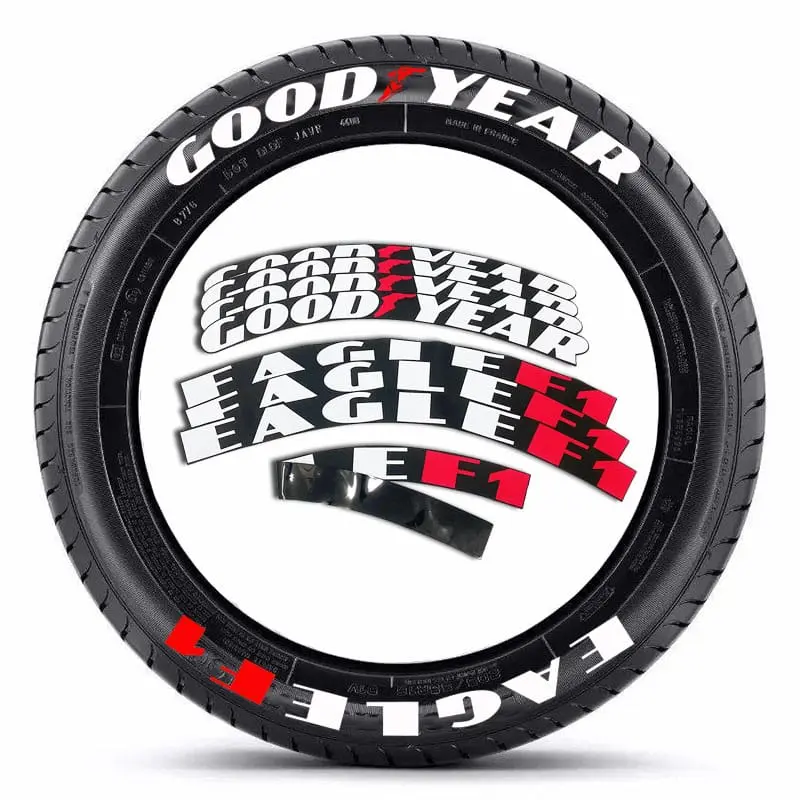
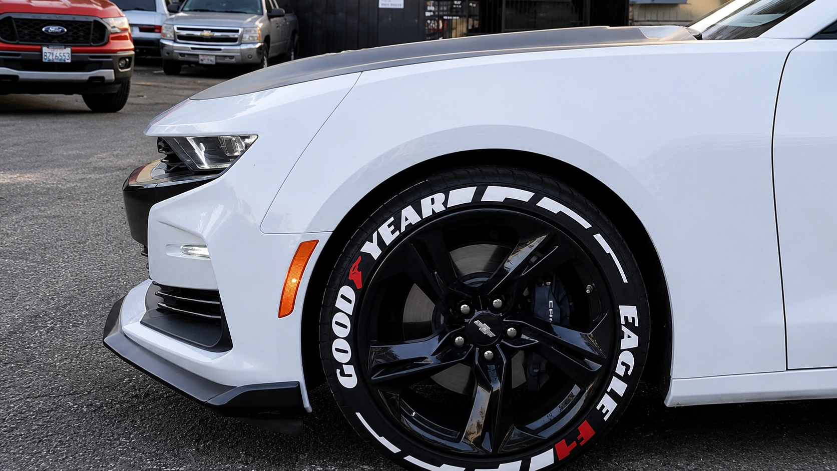
Bold, blocky letterforms — the heavy Eagle look that suits muscle and pony cars.
High-contrast white for maximum pop against black wheels.
Pair the wordmark with an "Eagle F1" second line for the full performance stack.
Goodyear’s Eagle lettering is American muscle in type form — blocky, bold and high-contrast. It’s the look that belongs on a Camaro, Mustang or Challenger at a cruise night.
This is not a subtle style. Push letter height toward the upper end (60–65% of the gap) and keep the letterforms heavy. The point is presence.
Half the Goodyear look is the two-line stack — the brand wordmark up top with a performance sub-line (“Eagle F1”) below. Our custom kit does both lines; keep the tracking even so the stack reads clean.