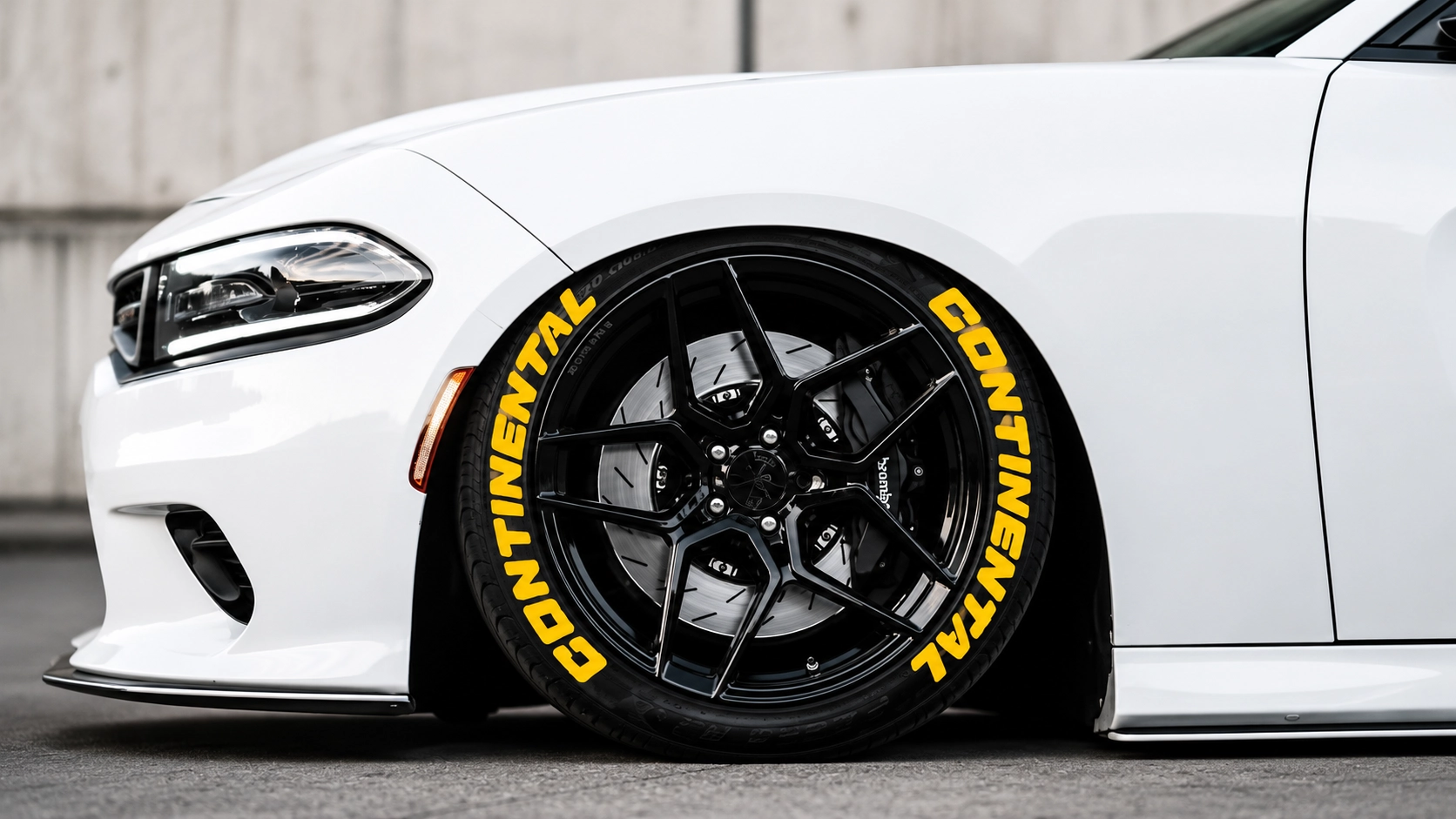
Continental’s look leans European and understated — the clean sport-touring aesthetic you’d find on a well-sorted German build. It’s about restraint, not shout.
Let the spacing breathe
Continental’s read comes from generous negative space. Don’t crowd the letters; keep them slim-to-medium and give them room. The gaps do as much work as the letters.
Understated on purpose
Skip color and heavy weights here. Matte white, even tracking, centered — the whole point is that it looks like it came that way from the factory.